


Sadler Construction / Website creation
Good work.
Clearly presented.
A construction website needs to show the work, explain the services and make the next conversation easy. Here is how those ideas come together on the Sadler Construction website.
Designed around real projects, local service information and the questions homeowners ask before choosing a builder.

The identity
Slate blue, rust orange, bold Poppins headings and clear Roboto text.
The structure
Services, project galleries, customer feedback, FAQs and contact information.
The purpose
Help homeowners understand the work and start an informed conversation.
01 / Service navigation
Start with the job
you have in mind.
The services page uses five section links to take visitors straight to the type of work they need. The same services are introduced on the homepage, connecting the first visit with more detailed information.
01
Loft extensions
A dedicated section explains the service and places relevant project photography alongside the information.
02
Refurbishment
Renovation work has its own section, helping visitors distinguish whole-home changes from individual room improvements.
03
Kitchens
Kitchen design, installation and refurbishment are brought together with examples of the work.
04
Bathrooms
Bathroom work is presented as a distinct service, with its own information and supporting images.
05
Extensions
Extension information gives homeowners another clear starting point for exploring their project.
02 / The project portfolio
From a category
to the finer details.
The gallery organises work under Extensions, Refurbishment, Kitchen and Loft, with an All tab for the complete collection. Switching category changes the projects on view, making a large portfolio easier to explore.
Each project opens on its own page. Photo grids and enlarged lightbox images let visitors look more closely at the work, while a Back to Gallery link keeps the route through the portfolio clear.
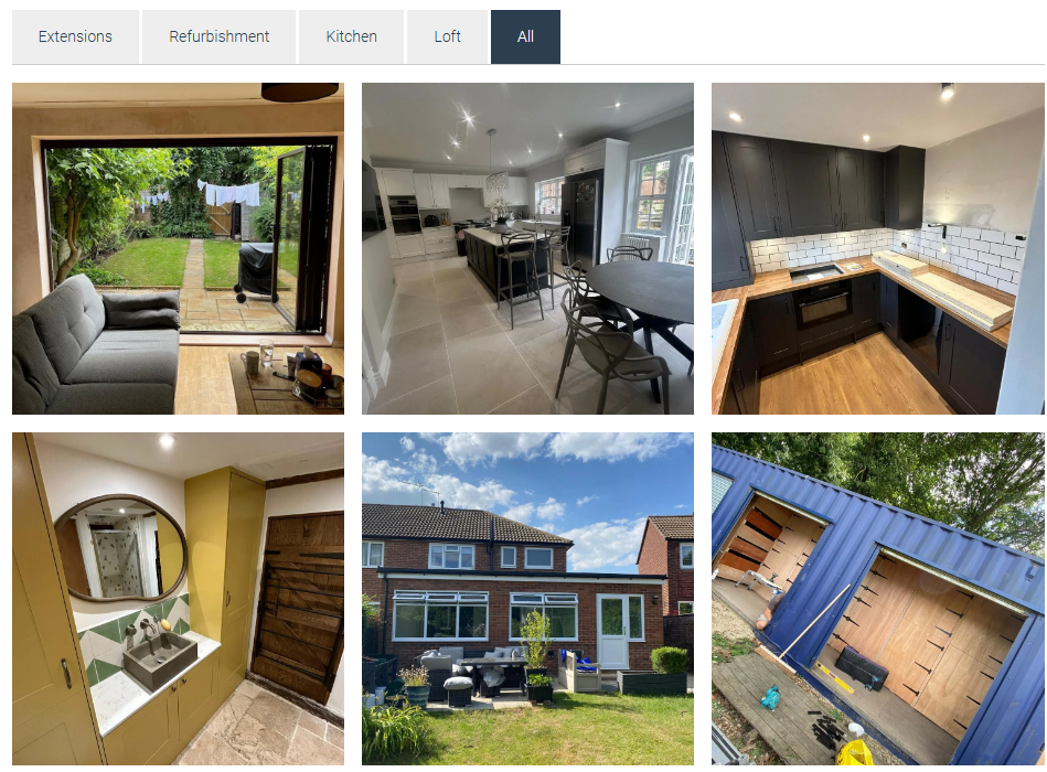
The live project gallery, shown with the All category selected.
03 / Confidence before contact
Let the work
and customers speak.
Customer feedback has a dedicated page, and a testimonial also appears on the homepage. Reviews are presented alongside the wider project portfolio, giving visitors different ways to assess the company’s work.
The FAQ page covers quotation stages, timescales, the building process, architects, materials and previous projects. It helps answer practical questions before the first conversation.
04 / A clear next step
Make it easy
to get in touch.
The homepage includes a prominent contact invitation, and the main navigation keeps the contact page close at hand. Telephone and email links provide direct ways to reach the team.
The contact page brings together the business address, company details and an embedded location map. Local service information on the homepage helps visitors understand the areas Sadler covers.
The website behind the pages
A consistent framework for the work.
The site combines a custom WordPress theme with editable content blocks. Individual project posts feed the portfolio and the recent-project section on the homepage, giving new work a place within the existing structure.
Shared navigation and footer content carry the same identity across the site. Responsive layouts adapt service sections, project grids and text for smaller screens, keeping the work at the centre of the experience.
Website design & development
Created for Sadler Construction.
This website was designed and developed by Advanced Web Designer, bringing service information, project photography and customer feedback together in a practical website for a local construction business.